eBird Visualizations: Eurasian Collared-Dove explosion
The total amount of data in eBird is starting to reach the point where some really interesting things can be done with it. In particular, enough users are putting in all their old data going back many decades that some long-term trends are starting to become evident. I decided to put together one example of this from the recent past, an animation showing the dramatic spread of the Eurasian Collared-Dove in North America over recent decades. Click on the image below to open a 775K animated GIF in a new window:
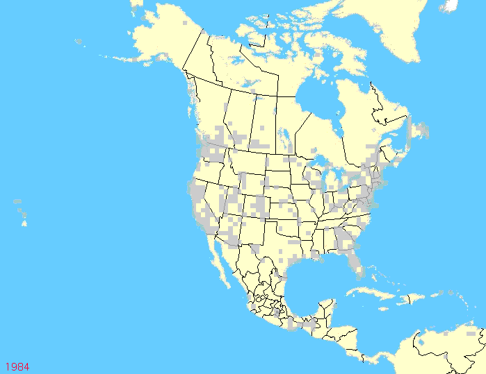
The image should play in a continuous loop after it downloads completely. It runs from 1984 until the present (through last month), one frame per year showing the aggregated data for the entire year. You can see how the expansion really began in the late 1990s, and took off explosively in the early Aughts. Note in the last few years how the numbers have begin increasing towards the south into Mexico and the eastern Caribbean as well.
The "negative" areas are of two kinds. The beige blocks are ones that contain no data; the gray blocks contain valid negative data. Note how the amount of beige drops over time steadily, from very spotty coverage in the 1980s to near continuous data across the Lower 48 and southern Canada in recent years. This spottiness makes it harder to see some of the more subtle and slower changes in populations. It also brings up one big question:
Are YOUR observations on these maps?
Putting all your lifetime's data in eBird is a time-consuming task, but it is also very rewarding. On beyond the interest of going through all your old notes and seeing all your data neatly summarized, and the satisfaction of having made your personal data available for the whole world to study and benefit from, you also have an off-site backup of all your field notes should something catastrophic befall your own copies. This "cloud-sourced" backup is hosted and managed by two institutions (Cornell and National Audubon) that have been around for quite a long time (unlike, say, Google and Flikr) and are likely to be with us for a long time to come. So, are your data on these maps, and if not, why not?
Making this animation by hand was rather slow and tedious, but I will try to put together some others over the coming weeks and months.
posted by Bill Pulliam @ 10:08 AM
5 comments
![]()
![]()


5 Comments:
Bill, a fantastic and dramatic use of the data in e-bird to show the expansion of Eur. Collared-Dove, as well as the increasing quantity of data being entered. Is there any way to view the slideshow more slowly or, indeed, freeze it on an individual year?
Rob Parsons
Winnipeg, MB
CANADA
So interesting to see the explosion so drastic everywhere EXCEPT the Atlantic coast. They've hit a bit of a wall along the southeast Atlantic coast for whatever reason.
just stopped by to wish good tidings for the times to come, Bill.
Merry holidays !
We've got lots of Eurasian Doves around our place. I'm seriously thinking about getting a pellet gun and hunting them for food. The Fish and Game says I can shoot all I want anytime of year, so why not.
Bear
Bear -- go for it! There are already too many exotic invasive species spreading throughout the west. See if you can get one with your bow...
If you haven't hunted doves before, though, folks down south refer to is as going out to shoot AT the doves, not actually shoot the doves.
Post a Comment
<< Home